Make a relative abundance barplot of taxon abundances.
phylogram(...)

# S3 method for default
phylogram(Tab, Map = NULL, facet = NULL,
  colname = "Sample", variable.name = "Taxon", value.name = "Abundance",
  scales = "free_x", space = "free_x", nrow.legend = 20, ntaxa = NULL,
  other_name = "other")

# S3 method for Dataset
phylogram(Dat, facet = NULL, colname = "Sample",
  variable.name = "Taxon", value.name = "Abundance", scales = "free_x",
  space = "free_x", nrow.legend = 20, ntaxa = NULL,
  other_name = "other")
Arguments
| Tab | A matrix object representing samples as columns and taxa as rows. |
|---|---|
| Map | A data frame with metadata for Tab. One row per sample, and the rows must be named to match the column names in Tab, and they must be in the same order. |
| facet | facet formula for facet_grid. |
| colname | Label to be used in the x-axis of the phylogram. |
| variable.name | Label to be used in for the colors in the phylogram |
| value.name | Label for the y-axis of the phylogram. |
| scales | scales option for facet_grid. |
| space | space option for facet_grid |
| nrow.legend | number of rows to use in the legend. |
| ntaxa | Number of taxa to plot, the rest will be collapsed into one category. Samples will be sorted by abundance and the top ntaxa will be plotted. |
| other_name | Name to give to the collapsed taxa when ntaxa is used. |
| Dat | A Dataset object. |
Value
A ggplot2 object of the plot.
Examples
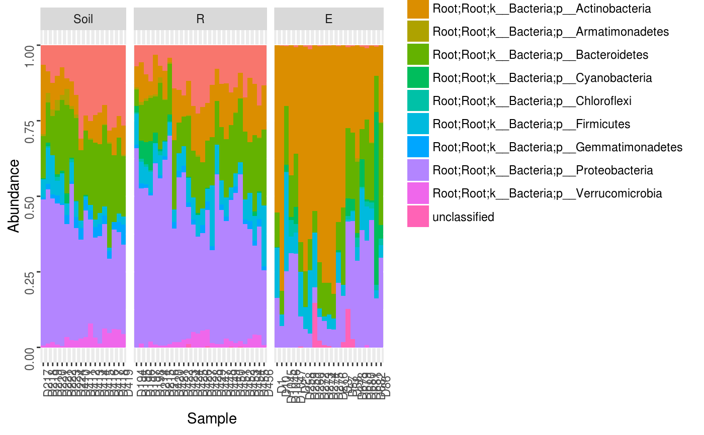
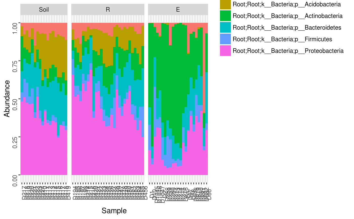
data(Rhizo)
data(Rhizo.map)
data(Rhizo.tax)
Dat <- create_dataset(Rhizo,Rhizo.map,Rhizo.tax)

Dat.phyl <- collapse_by_taxonomy(Dat = Dat, level = 4)
phylogram(Tab = Dat.phyl$Tab,
          Map = Dat.phyl$Map,
          facet = ~ fraction)phylogram(Dat.phyl, facet = ~ fraction)phylogram(Dat.phyl, facet = ~ fraction,
          ntaxa = 5)