Make rank abundance plot with Poisson confidence intervals.
Source:R/plotgg_rankabun2.r
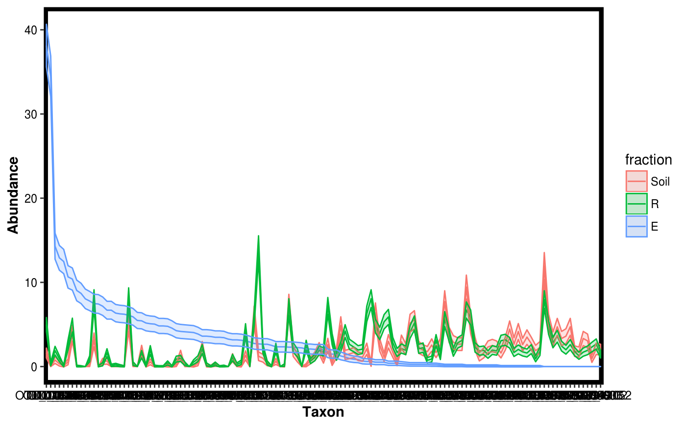
plotgg_rankabun2.RdMake a rank abundance plot with Poisson confidence intervals from a Dataset object. IMPORTANT: There is no guarantee that Poisson confidence intervals are representative of the data. This should be viewed only as descriptive statistic and not for inference.
plotgg_rankabun2(...)

# S3 method for default
plotgg_rankabun2(Tab, Map, groupby, sortby, alpha = 0.2,
  theme = theme_blackbox(), variable.name = "Taxon",
  value.name = "Abundance", sample.id.name = "SAMPLEID")

# S3 method for Dataset
plotgg_rankabun2(Dat, groupby, sortby, alpha = 0.2,
  theme = theme_blackbox(), variable.name = "Taxon",
  value.name = "Abundance", sample.id.name = "SAMPLEID")
Arguments
| Tab | A matrix object with samples as columns and taxa as rows. |
|---|---|
| Map | A data frame with metadata forTab. Each row must be a sample with row names matching column names in Tab and in the same order as in Tab. |
| groupby | Variable name to be used for grouping samples before plotting th rank abundance. |
| sortby | Variable value to be used as reference for sorting the taxa in the rank abundance plot. |
| alpha | Transparency parameter for ggplot2 |
| theme | ggplot2 theme to be used for plotting. |
| variable.name | x-axis label in the plot. |
| value.name | y-axis label in the plot. |
| sample.id.name | name to store sample IDs in Map. Used for internal handling only. |
| Dat | A Dataset object. |
Value
A ggplot2 plot.
See also
Examples
data(Rhizo)
data(Rhizo.map)
data(Rhizo.tax)
Dat <- create_dataset(Rhizo, Rhizo.map, Rhizo.tax)

plotgg_rankabun2(Tab = Dat$Tab,Map = Dat$Map,
                 groupby = "fraction",sortby = "E")plotgg_rankabun2(Dat, groupby = "fraction", sortby = "E")